Reimagining the Olympics Through Vietnamese Culture
What if a global design felt more local
The Olympics and its branding are built for recognition and scalability, but the line between authentic and oversimplified blurs. It’s a battle of cultural elements become surface-level or decorative, visual systems prioritize neutrality over identity, and meaning is simplified to fit global expectations
As a result, the host country is present, sometimes lost.
This project reimagines the Olympics as more than an event. My goal is to create cultural expression.
By focusing the identity in Vietnamese symbolism and visual language, the system becomes more than decoration. It becomes something intentional, carrying history, values, and meaning across every visual element.
When identity gets simplified into branding
I grew up surrounded by Vietnamese culture in everyday life through colors, objects, and traditions. When I thought about creating a design system for the Olympics inspired by Vietnamese culture, my first question was what’s often overlooked. These events are designed to be universally understood, but by doing so, they can come off as flatten the identity of the place they represent.
I didn’t want to design something that looked Vietnamese. I wanted to build a system where culture could still be felt, even when scaled to something global.
Designing from culture instead of for it
-
I began by stepping away from design and focusing on understanding:
Vietnam’s history of resilience and independence
The role of family and community
Spiritual influences rooted in Buddhism, Taoism, and Confucianism
The importance of tradition and continuity
These are more than references. They became the foundation for every design decision.
-
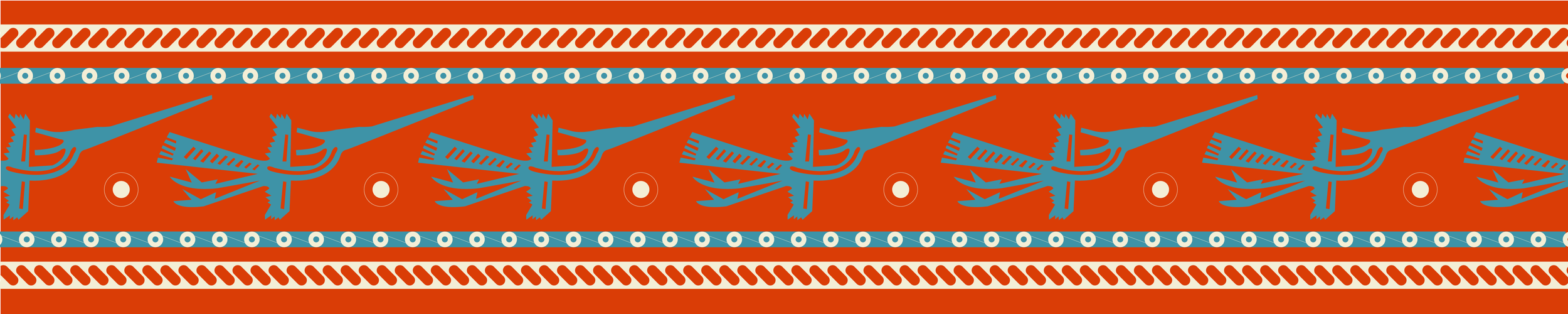
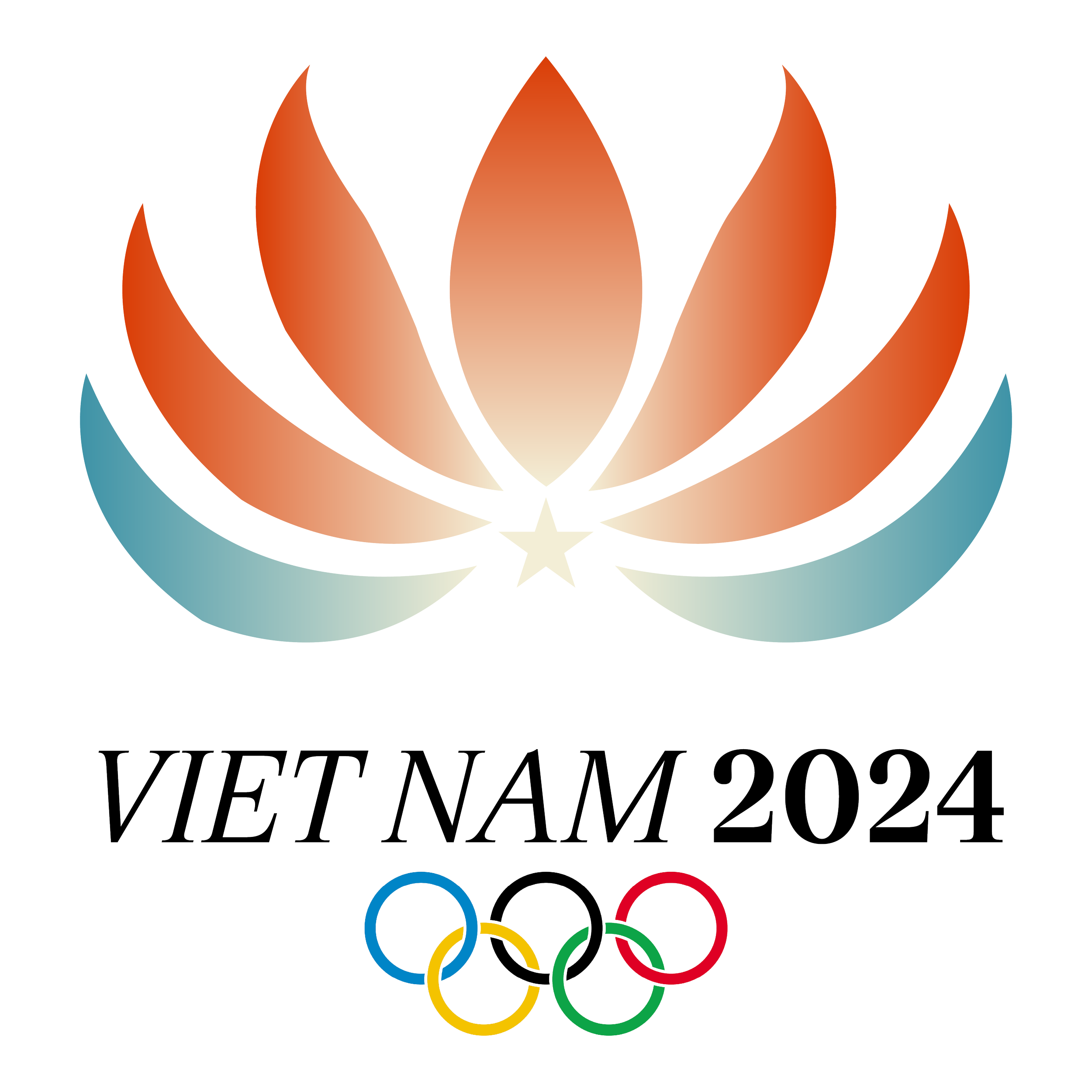
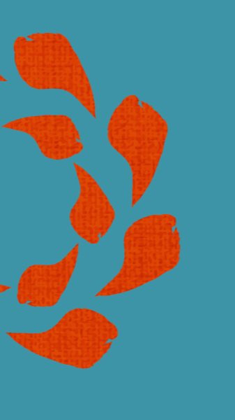
From this, I focused on three key symbols:
Lotus flower: resilience, growth, spiritual clarity
Đông Sơn drum: rhythm, connection, shared identity
Nón lá: everyday life, heritage, familiarity
I forced on what they represent as well as how they could shape form.
-
I started piecing these symbols into visual components:
Repetition and radial patterns inspired by the drum
Soft, organic curves drawn from the lotus
Geometric simplifications for scalability
This became less about illustration and more about building a visual system that could expand.
-
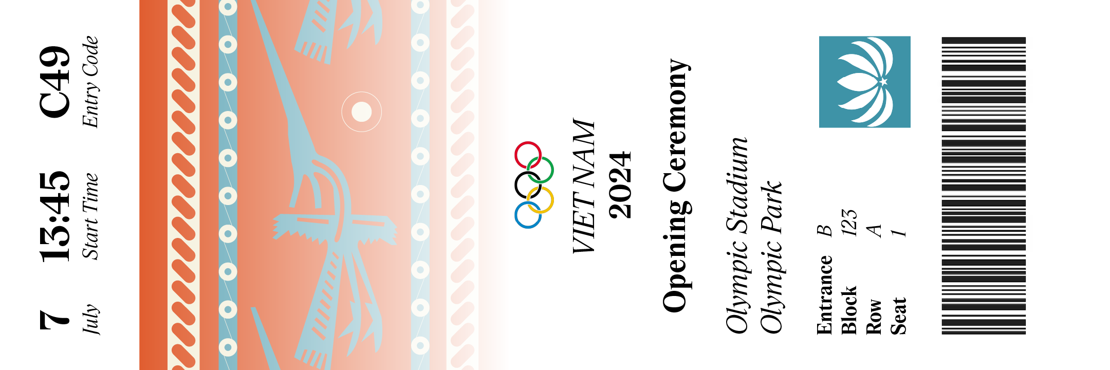
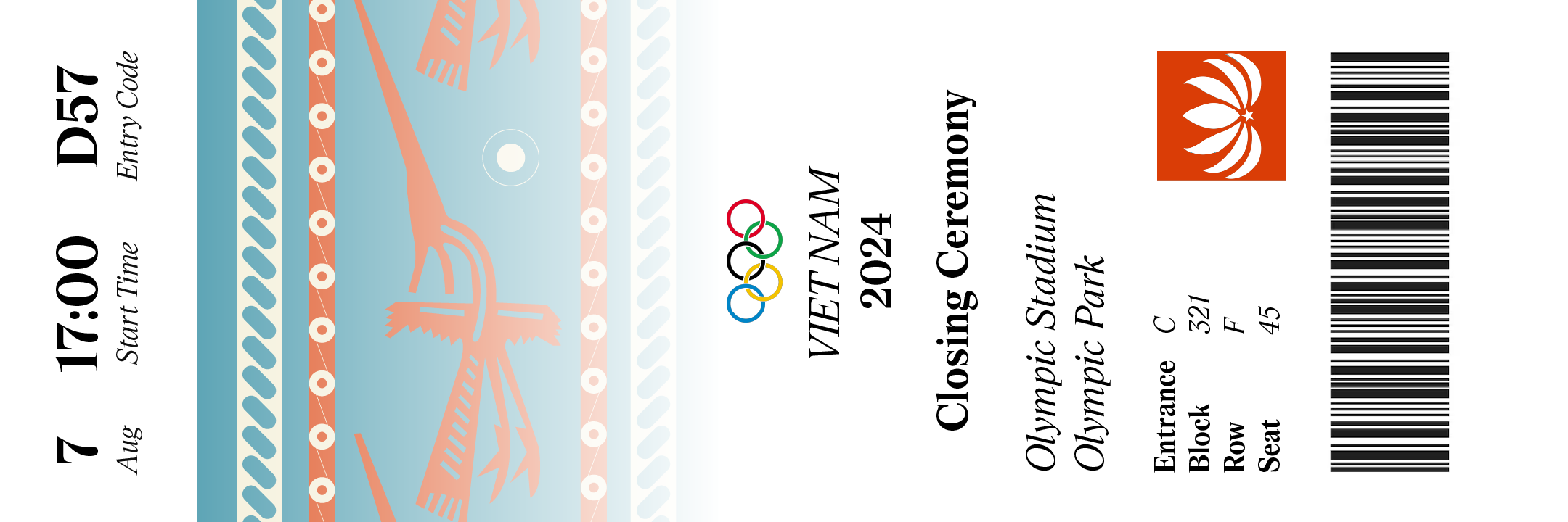
From there, I developed one identity:
Color
A deep red that carries strength and history
A muted blue to balance and modernize
Soft neutrals to ground the system
Typography
Clean and legible to maintain global accessibility
Paired with expressive visual elements to compliment form.
Motif
A flexible pattern language inspired by cultural designs
Designed to scale across small and large applications
Every element was created to work both independently and together.
-
This identity extends across multiple areas in the system:
Tickets
Merchandise
Event materials
Each application reinforces the same visual language while adapting to different purposes.
While my focus was consistency, I also wanted to make sure it stayed cohesive by making sure everything felt like it belonged.
Holding meaning across a complete system
This project highlights my ability to work across:
Visual design: color, typography, and composition
Brand systems: consistency across multiple applications
Cultural research: grounding design in meaning, not aesthetics
It reflects how I approach design as both a visual and conceptual practice.
At first, I was focused on making the system visually compelling. But the more I worked on it, the more I realized that the strongest visuals weren’t the most complex. The system didn’t feel complete until the designs felt the most grounded.
This project taught me that cultural design focuses on knowing what ‘s working, what’s not working, and what can be improved.
If I continued this project, I would want to:
Expand into motion and ceremony design
Explore how the system behaves in physical space
Test how it translates across different audiences